Document
book_icon Case study

Case study of EVJOINTS

Empowering Electric Vehicle Charging for a Greener Future

ev_joint-logo
Document

Problem Statement

lines
lines

Objectives

Objectives

lines

Methodology

The development of EVJOINTS followed a systematic approach:

1

Requirement Gathering:

box_logo

EVJOINTS, in collaboration with Techstalwarts, conducted extensive market research and gathered user feedback to identify the specific pain points of EV owners during the charging process.

3

Technology Stack

box_logo

Techstalwarts, in consultation with EVJOINTS, selected Node.js for the backend due to its scalability and real-time capabilities. For the frontend, React, Kotlin, and Swift were chosen to develop cross-platform mobile applications with optimal performance and native-like experiences.

5

Quality Assurance

box_logo

Rigorous testing was conducted by Techstalwarts to ensure the app's reliability, security, and seamless functionality.

bullet

2

Design and Prototyping

box_logo

UI/UX designers, working closely with Techstalwarts, created wireframes and interactive prototypes, iterating based on user feedback to ensure a user-friendly interface and seamless user experience.

4

Agile Development

box_logo

The project was developed following an agile methodology, enabling continuous iterations and swift adaptation to changing requirements.

Methodology

The development of EVJOINTS followed a systematic approach:

1

Requirement Gathering:

box_logo

EVJOINTS, in collaboration with Techstalwarts, conducted extensive market research and gathered user feedback to identify the specific pain points of EV owners during the charging process.

2

Design and Prototyping

box_logo

UI/UX designers, working closely with Techstalwarts, created wireframes and interactive prototypes, iterating based on user feedback to ensure a user-friendly interface and seamless user experience.

3

Technology Stack

box_logo

Techstalwarts, in consultation with EVJOINTS, selected Node.js for the backend due to its scalability and real-time capabilities. For the frontend, React, Kotlin, and Swift were chosen to develop cross-platform mobile applications with optimal performance and native-like experiences.

4

Agile Development

box_logo

The project was developed following an agile methodology, enabling continuous iterations and swift adaptation to changing requirements.

5

Quality Assurance

box_logo

Rigorous testing was conducted by Techstalwarts to ensure the app's reliability, security, and seamless functionality.

Document

EVJOINTS, developed by Techstalwarts, was implemented
with the following key features:

The development of EVJOINTS followed a systematic approach:

Mobile App (Android and iOS)

box_logo

EV owners could easily book charging sessions, locate nearby charging stations, and access real-time charging station availability through the mobile app.

Website

box_logo

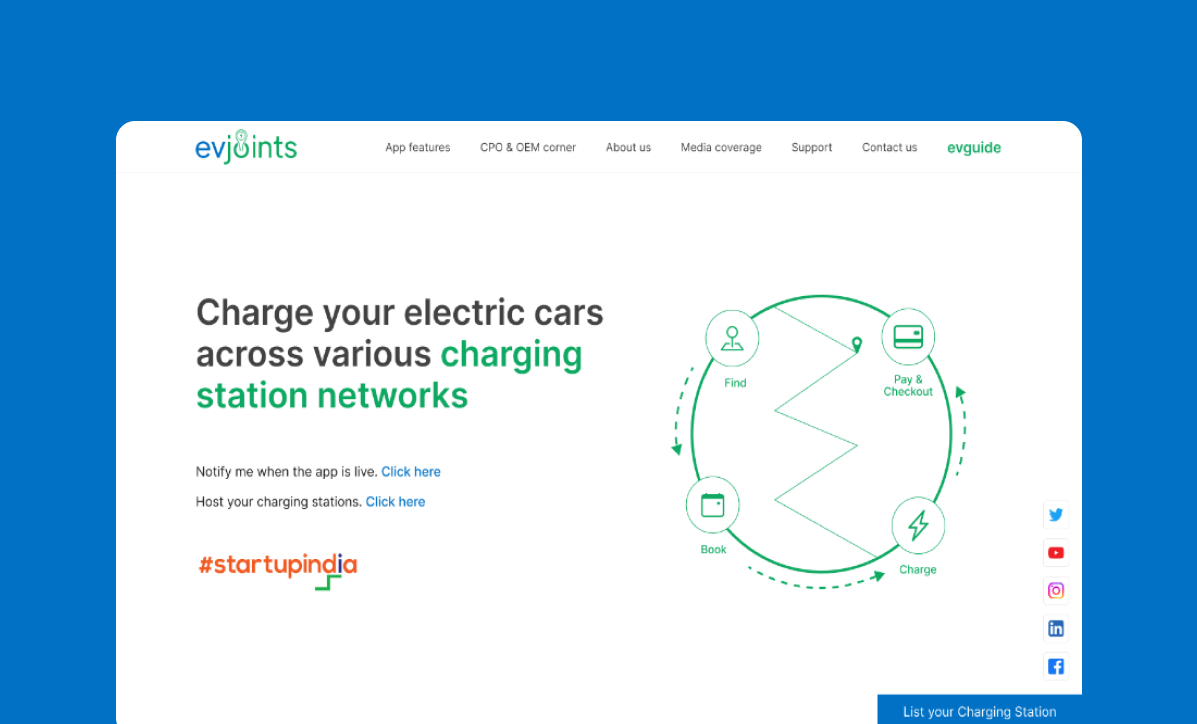
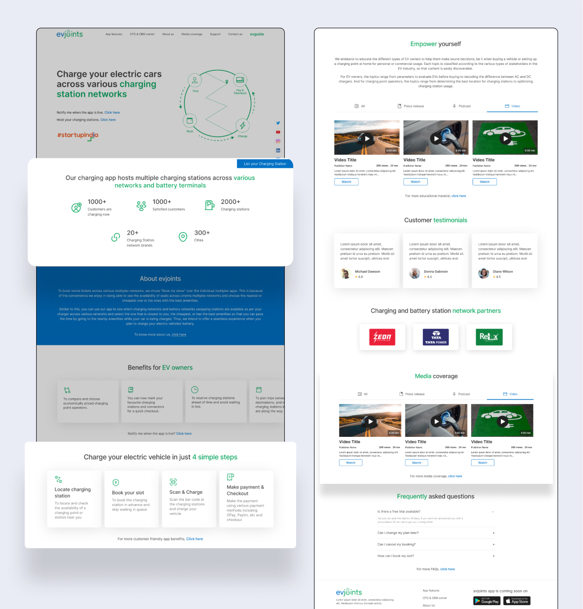
The responsive website provided users with an additional platform to access charging station information and plan their trips efficiently.

Admin Portal

box_logo

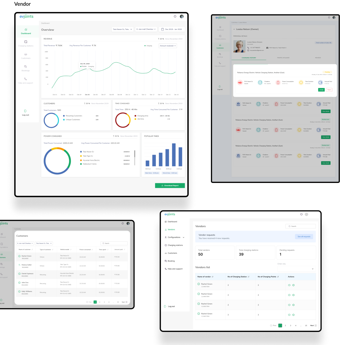
The admin portal, expertly crafted by Techstalwarts, allowed efficient management of charging station data, bookings, and user interactions, ensuring smooth operation of the platform.

Dealer Portal

box_logo

The dealer portal, developed in collaboration with Techstalwarts, facilitated seamless communication and interactions between charging station operators and the EVJOINTS platform.

Document
logo

Design

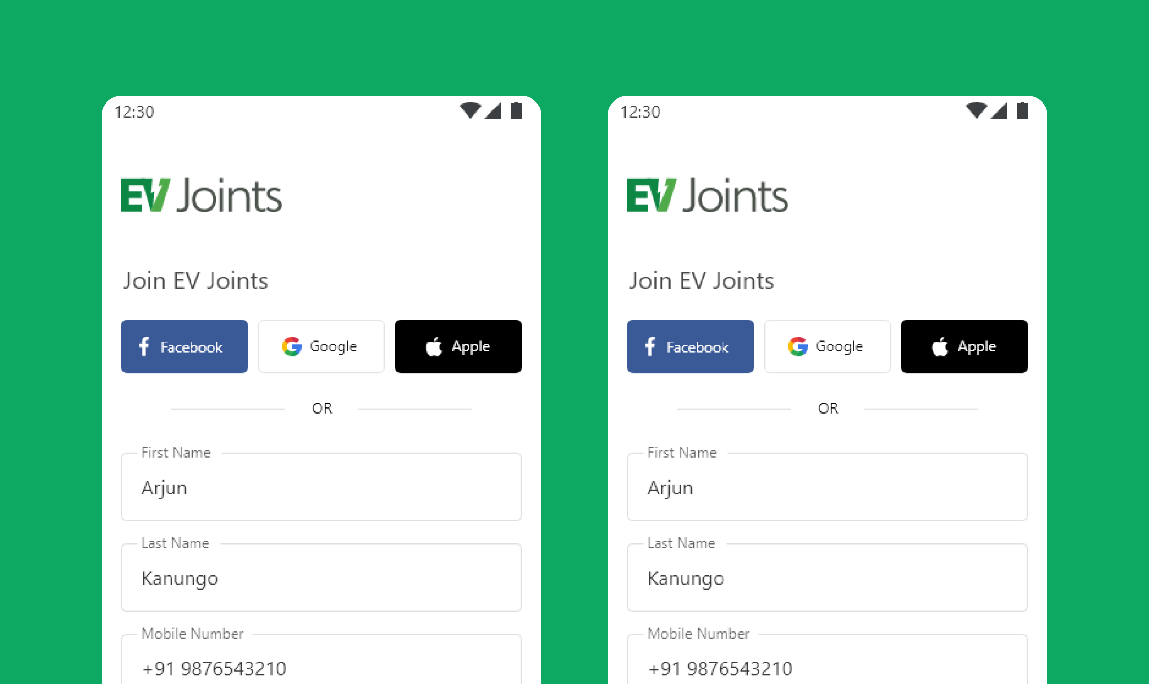
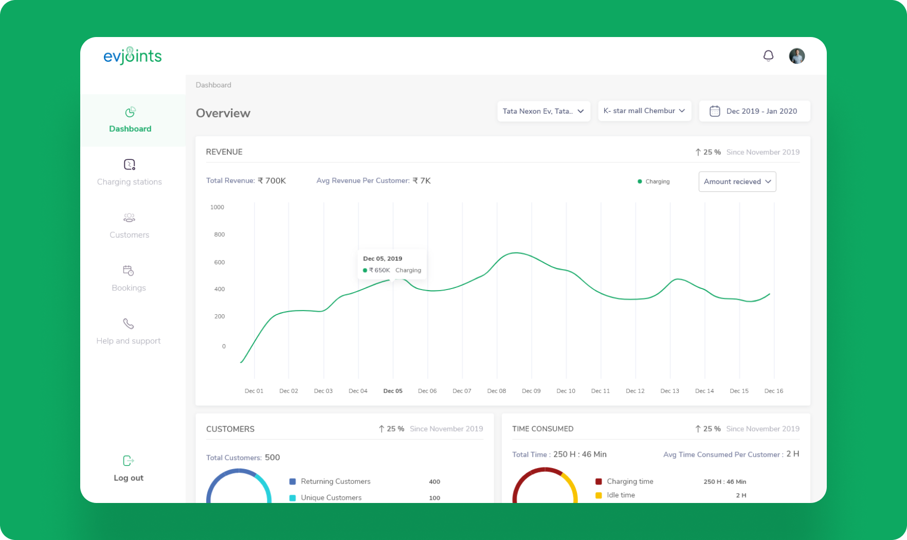
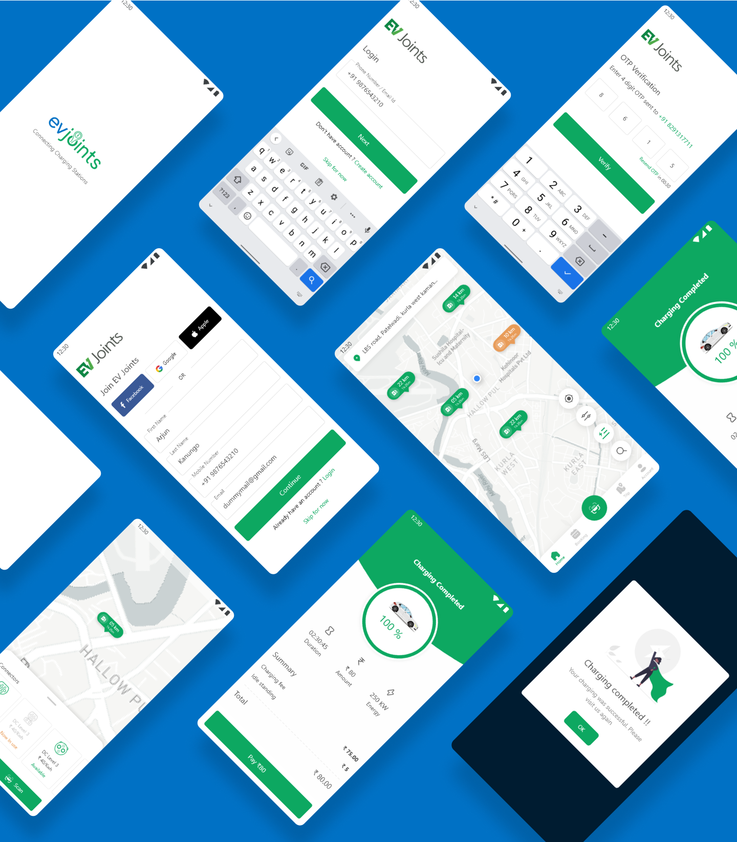
We must make sure that each person's opportunities and pain spots were taken into consideration while keeping in mind the aforementioned points. We designed the screens for mobile application, website and dashboards for admin and vendors. We made sure that the onboarding process was quick and easy, and we then created a homepage that was highly intuitive, dynamic, and aesthetically appealing.

logo logo
logo logo
logo
logo
logo
Document

Typeface

Inter

Inter is a free google font whose look and feel is close to Helvetica. It renders well on all screen sizes, looks professional and gives justice to the brand.

Aa

Inter Semi-bold

for headings

Aa

Inter Medium

for sub-headings

Aa

Inter Regular

for body

Font usage

Semi Bold - headings

a b c d e f g h i j k l m n o p
q r s t u v w x y z

Semi Bold - headings

a b c d e f g h i j k l m n o p
q r s t u v w x y z

Regular - body

a b c d e f g h i j k l m n o p
q r s t u v w x y z

Document

Colors

Our primary and secondary colors are blue and green respectively. Blue is a reliable color that carries connotations of stability, wisdom and serenity whereas green evokes a feeling of abundance and is associated with refreshment, peace, rest and security.

logo

User Interface

Our primary and secondary colors are blue and green respectively. Blue is a reliable color that carries connotations of stability, wisdom and serenity whereas green evokes a feeling of abundance and is associated with refreshment, peace, rest and security.

logo logo
logo
logo